Lino’s Type / Lino’s & Co
Creative Vision
Brand Identity
& Product Direction
From print workshop to creative ecosystem.
Building a Hybrid Creative Ecosystem Between Craft, Typography
& Social Innovation
In the heart of Verona, two Heidelberg presses became the starting point for an experimental laboratory exploring typography, visual culture, craftsmanship, and collaborative design.
❋ RoleCo-Founder | Creative Direction
Brand Identity | Visual Language
Product Development | Editorial Design
Workshop Design
❋ Studio FocusTypography | Letterpress |Craftsmanship
Hybrid Design Systems |Coworking Culture
Social Innovation
❋ LocationsVerona | Udine | Mantua | Genoa
❋ RecognitionTelecom Impresa Recognition
Featured in Monocole , Wired & Italian design and innovation press.
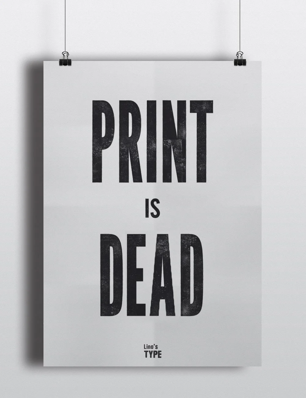
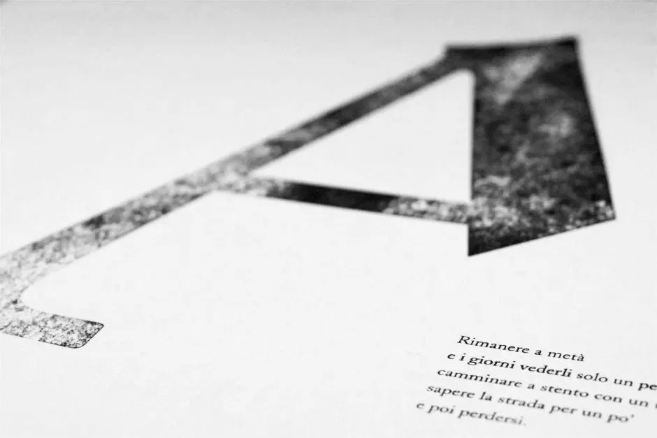
The defect of print is the testimony of process /
The defect of print is the testimony of process /
The ContextReimagining Print Culture
in the Digital Era
Lino’s Type was born during a moment of radical transition in visual culture.
As digital technologies transformed communication and accelerated production cycles, traditional printmaking was increasingly perceived as obsolete too slow, too manual, too imperfect.
Yet precisely within this shift emerged a new cultural desire: for tactility, permanence, material intelligence, and human presence.
Lino’s did not oppose technology.
Instead, it explored the possibility of coexistence between mechanical processes and digital culture, between typographic heritage and contemporary visual languages.
The workshop became an open field of experimentation:
a place where paper, ink, interfaces, coding, typography, poetry, branding and craftsmanship could enter into dialogue.

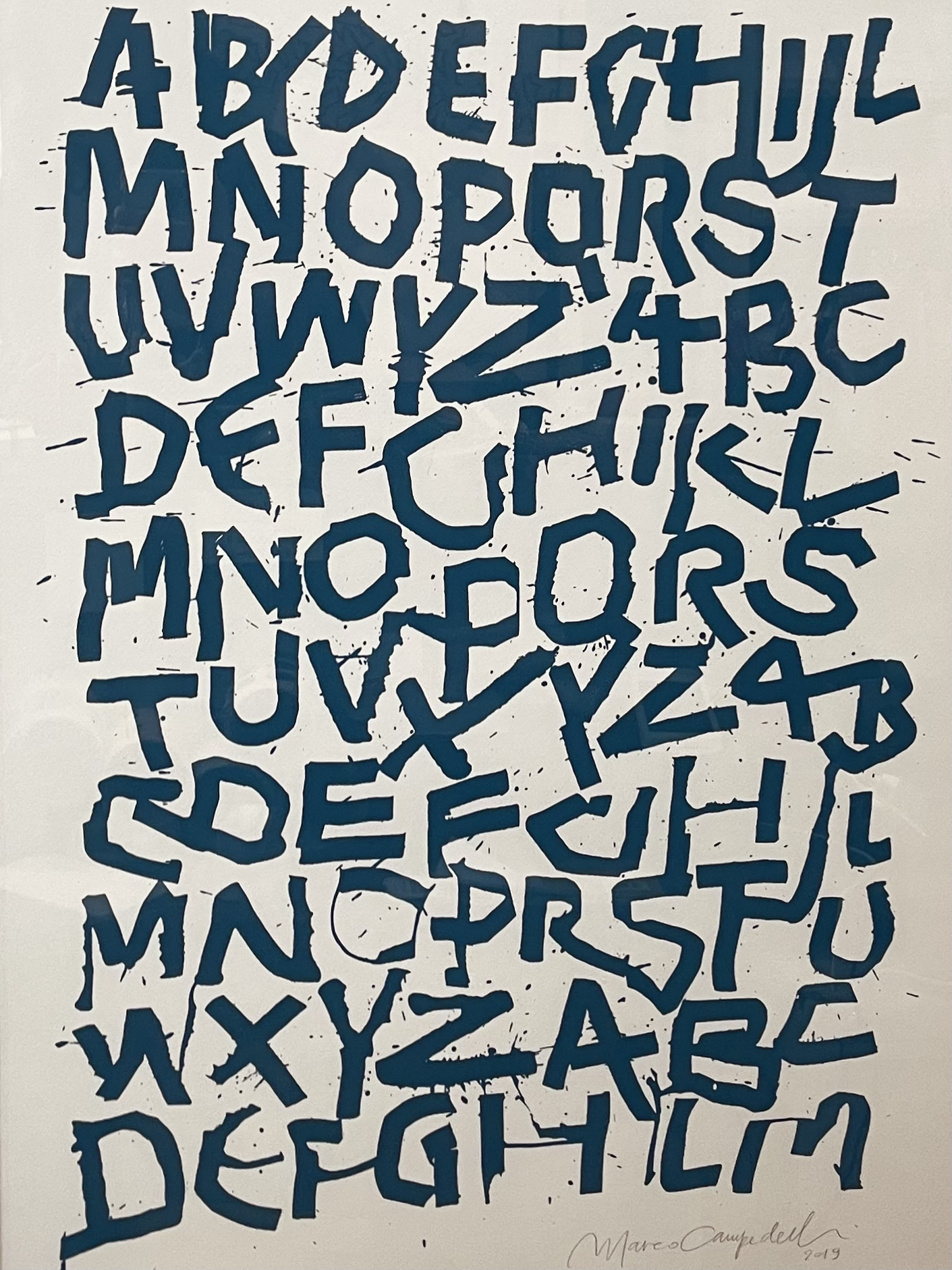
The Creative ApproachA Hybrid Visual Language

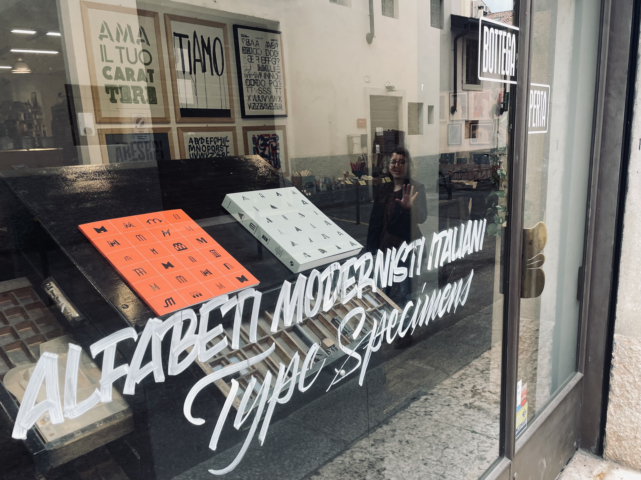
The visual identity I designed was conceived as an intentional contamination between analog and digital aesthetics.
The iconic “typographic moustache” logo became both symbol and manifesto:
a pseudo-glyph created through typographic experimentation, balancing physical print imperfection with the immediacy of contemporary digital symbols.
Printed on cotton paper with visible texture and pressure marks, the identity embraced error as a creative language.
Misalignments, ink variations, and material traces were not treated as defects to eliminate, rather as evidence of time, touch, and process.

From Workshop
to Creative Ecosystem
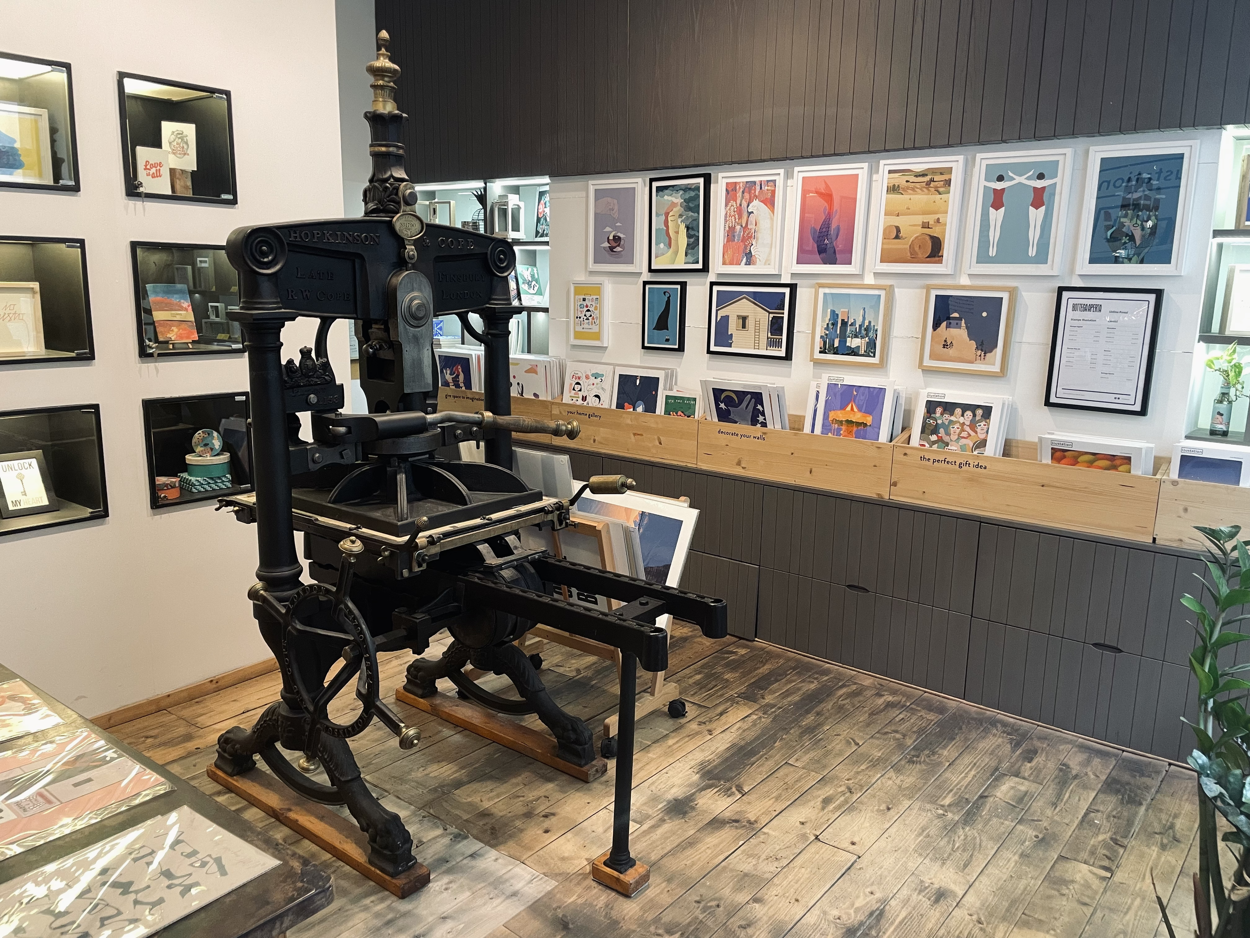
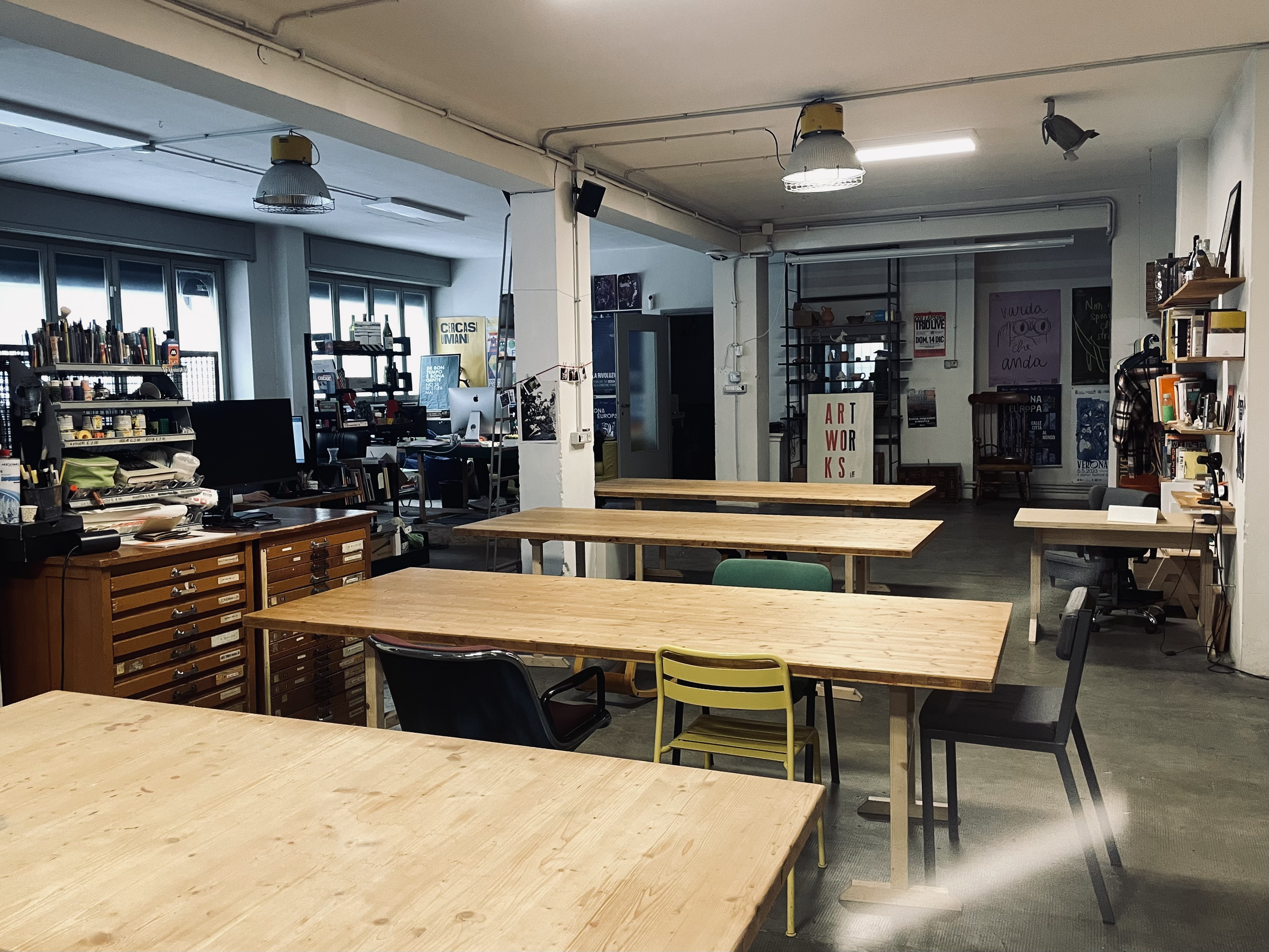
The studio rapidly evolved beyond the traditional boundaries of a print shop.
Lino’s became:
a coworking space,
a collaborative studio,
a workshop for experimental typography,
a platform for independent creatives,
and a social environment for interdisciplinary exchange.
Designers, illustrators, printers, strategists, educators, artisans, and researchers shared the same space, generating a continuous dialogue between disciplines.
The project, as conceived by strategy consultant Nicola Zago, anticipated many dynamics now associated with contemporary creative hubs:
fluid collaboration, hybrid practices, community-based production, and experiential learning.
Elisa Fior and the production team are doing incredible work. By blending cutting-edge typography with social impact, they create beautiful visual products while actively providing job training and fostering work integration for disadvantaged individuals.


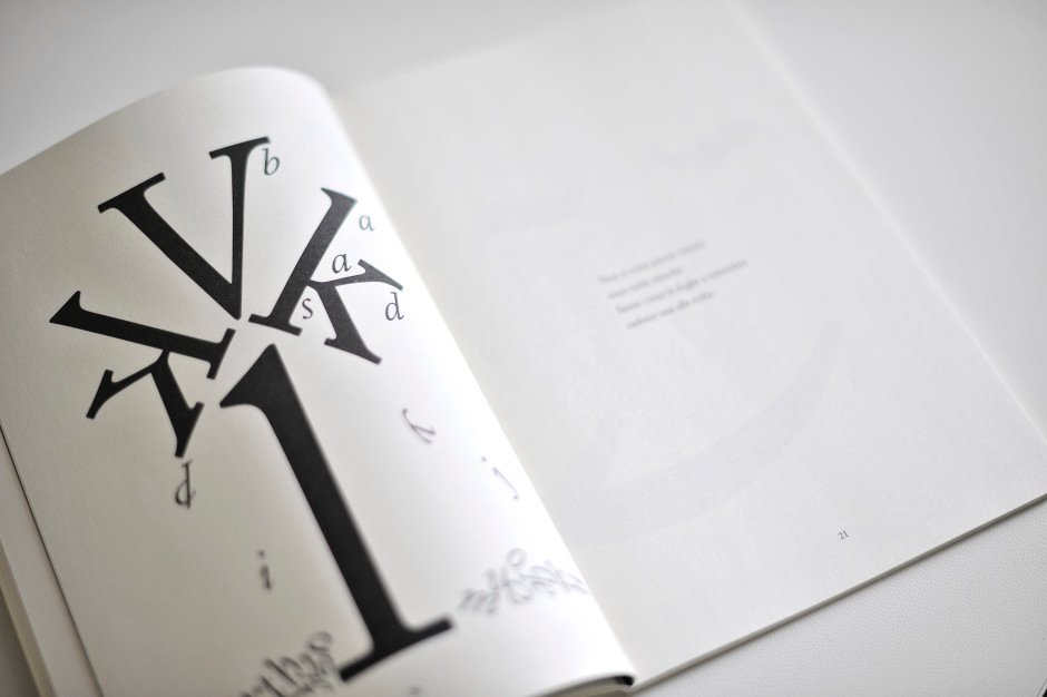
Typography as Human Language
For me typography was never simply graphic decoration.
Working with letters meant working with meaning, rhythm, silence, tone, and perception.
Letterforms became physical objects:
to rotate, overlap, deconstruct, ink, and reinterpret.
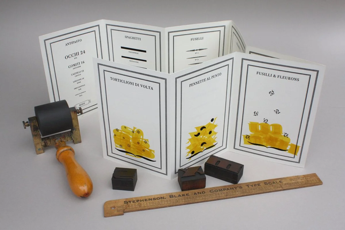
The project explored typography as:
visual poetry,
accessible conceptual art,
tactile communication,
and social interaction.
Inspired by experimental design practices and visual literature, the studio developed printed works balancing irony, conceptual thinking, emotional immediacy, and material presence.


The Value of Imperfection
Lino’s embraced “trial & error” as a design methodology.
The printing defect — the typographic moustache, the pressure mark, the irregular ink texture — became the visible trace of experimentation.
In a hyper-digitized visual culture dominated by smooth surfaces and instant production, letterpress offered another temporal dimension:
slowness, duration, waiting, touch.
Two-color printing required time to dry overnight.
Paper absorbed memory.
Objects carried process within themselves.
The workshop proposed a radically human approach to visual communication:
one rooted in attention, materiality, and sensory experience.
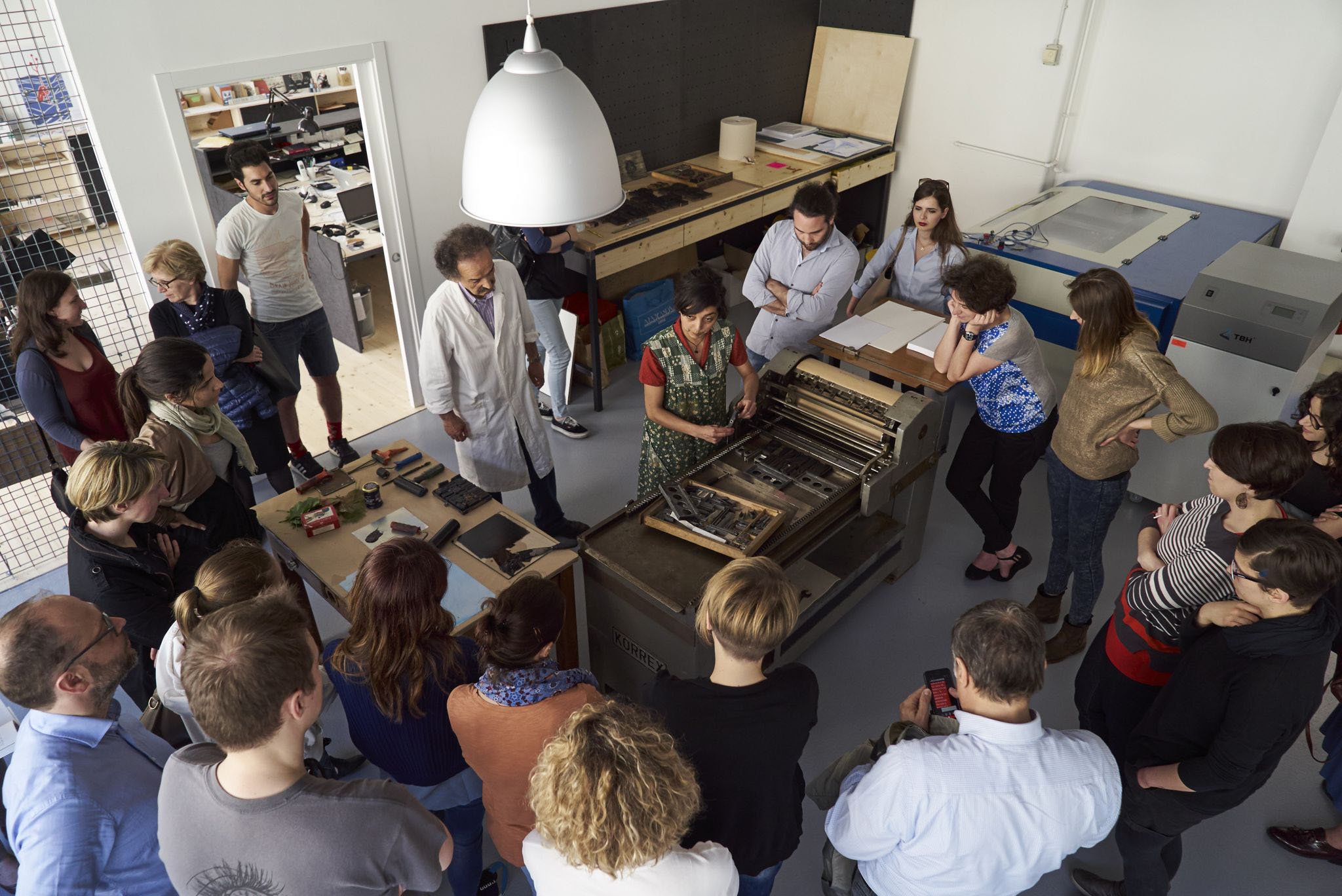
VISUAL CULTURE & COMMUNITYAlongside commissioned projects and independent printed editions, Lino’s became a cultural and educational platform.
The studio hosted:
workshops for adults and children,
typography laboratories,
collaborative publishing experiments,
exhibitions,
creative residencies,
talks and public events,
and interdisciplinary collaborations across Northern Italy.
The project connected design culture with education, social participation, and artisanal knowledge-sharing.
It transformed the print workshop into a contemporary civic space.
Cultural Impact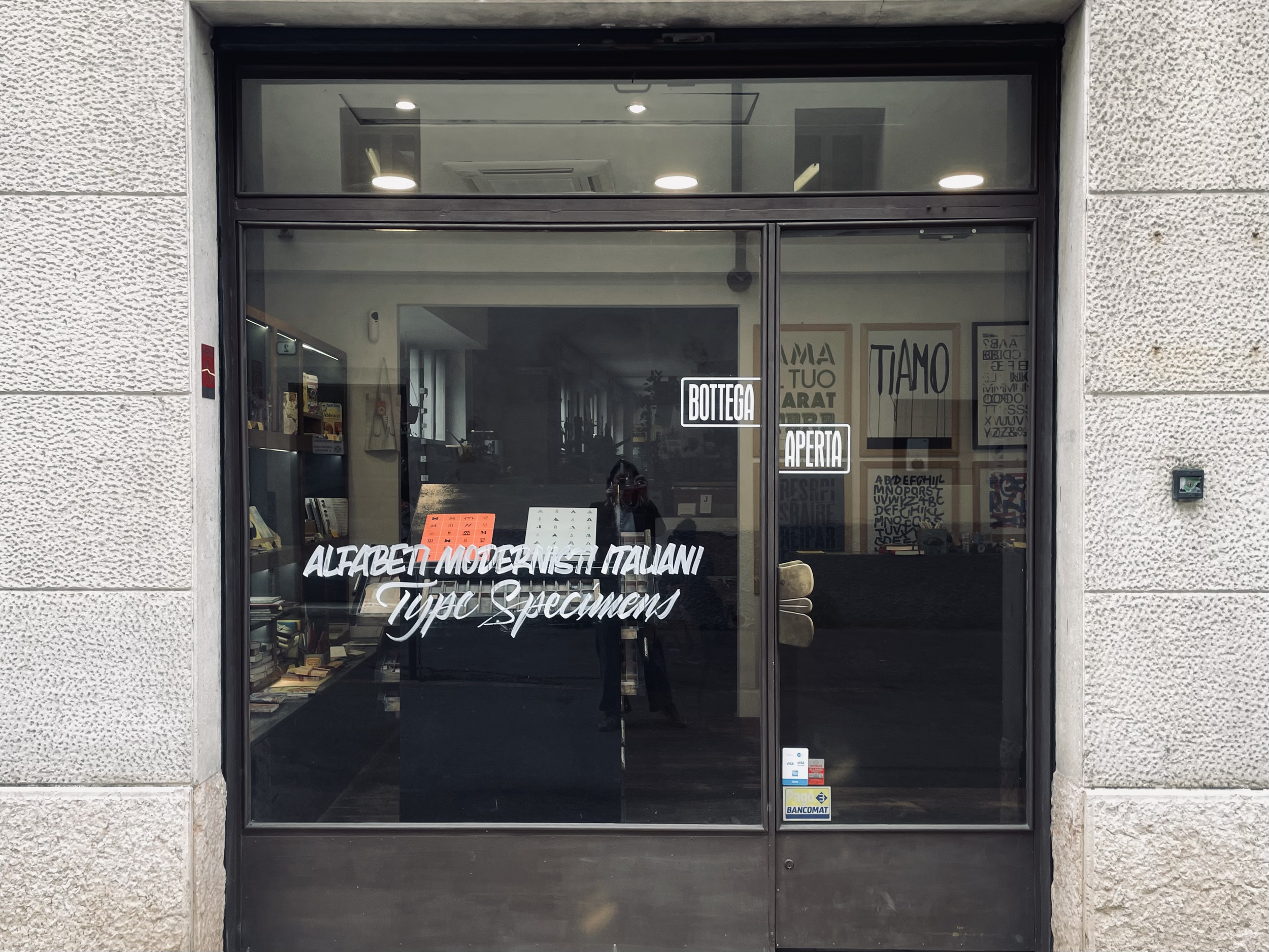
Outcome
Built one of the earliest hybrid craft/design coworking laboratories in Verona.
Developed a recognizable visual identity rooted in experimental typography and material storytelling.
Contributed to the revival of contemporary interest in letterpress and tactile print culture.
Created collaborative environments connecting designers, artisans, educators, and innovators.
Expanded into multiple creative realities across Northern Italy.
Anticipated many dynamics now central to contemporary creative ecosystems and human-centered design.
CONTINUING THE PHILOSOPHYFrom Letterpress to
Creative Studio Sessions
The experience of Lino’s continues today through my work
as Color & Cosmos Studio.
Creative Studio Sessions are multidisciplinary consulting experiences designed for brands, cultural projects, educators, independent businesses, and visionary founders seeking meaningful visual identities and coherent creative ecosystems.
The approach combines:
creative direction,
narrative positioning,
visual identity systems,
editorial thinking,
analog and digital integration,
AI-supported creative strategy,
craftsmanship culture,
and human-centered design.
Rather than separating disciplines, the work focuses on building connections between language, aesthetics, materiality, education, and emotional experience.